Colin Roitt
Maintaining an online presence is important in the modern world. If you make an online portfolio it
should be representative of the client and show off their work. This is exactly what I've done here - a
modern looking website with a transparent information. My favourite part is the navigation and
subheading allowing a user to see exactly what I do.

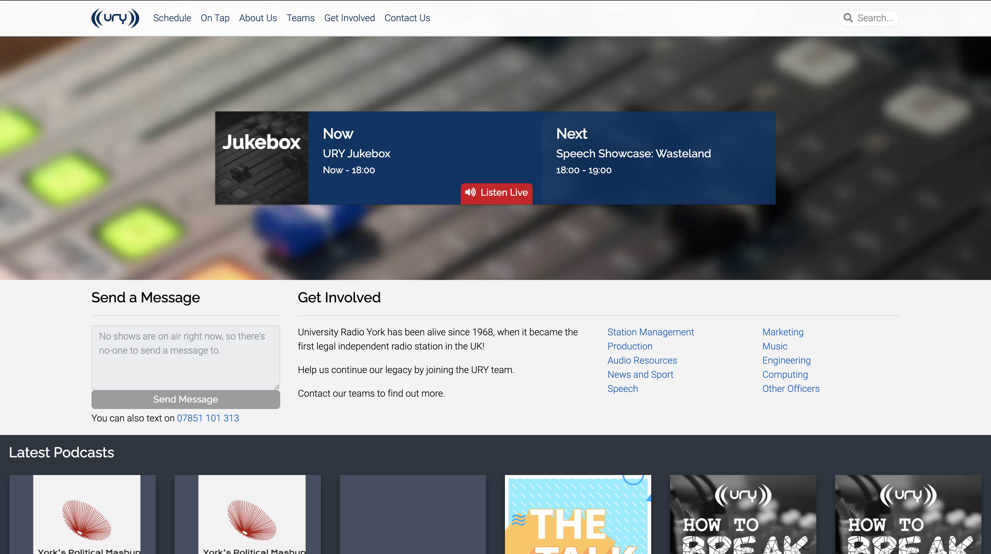
URY Website
I've worked all over the place with URY, presenting, production, and on our computer systems. I've
worked on extensive improvements to the user experience of the URY Website. Ultimately my aim was to
remove some of the issues users may face navigating the website, including button placement,
compatibility, and accessibility requirements such as image alt-text.

URY MyRadio
Running a radio station requires a lot of internal systems; these systems are within MyRadio, URY's
backend. While working with URY, my focus has been User Experience improvements. Small but valuable
tweaks making the website nicer to use for the user.
One major update was adding the webcam view screen seen here, so that users can select which webcam feed
they want to see - or see them all at once.

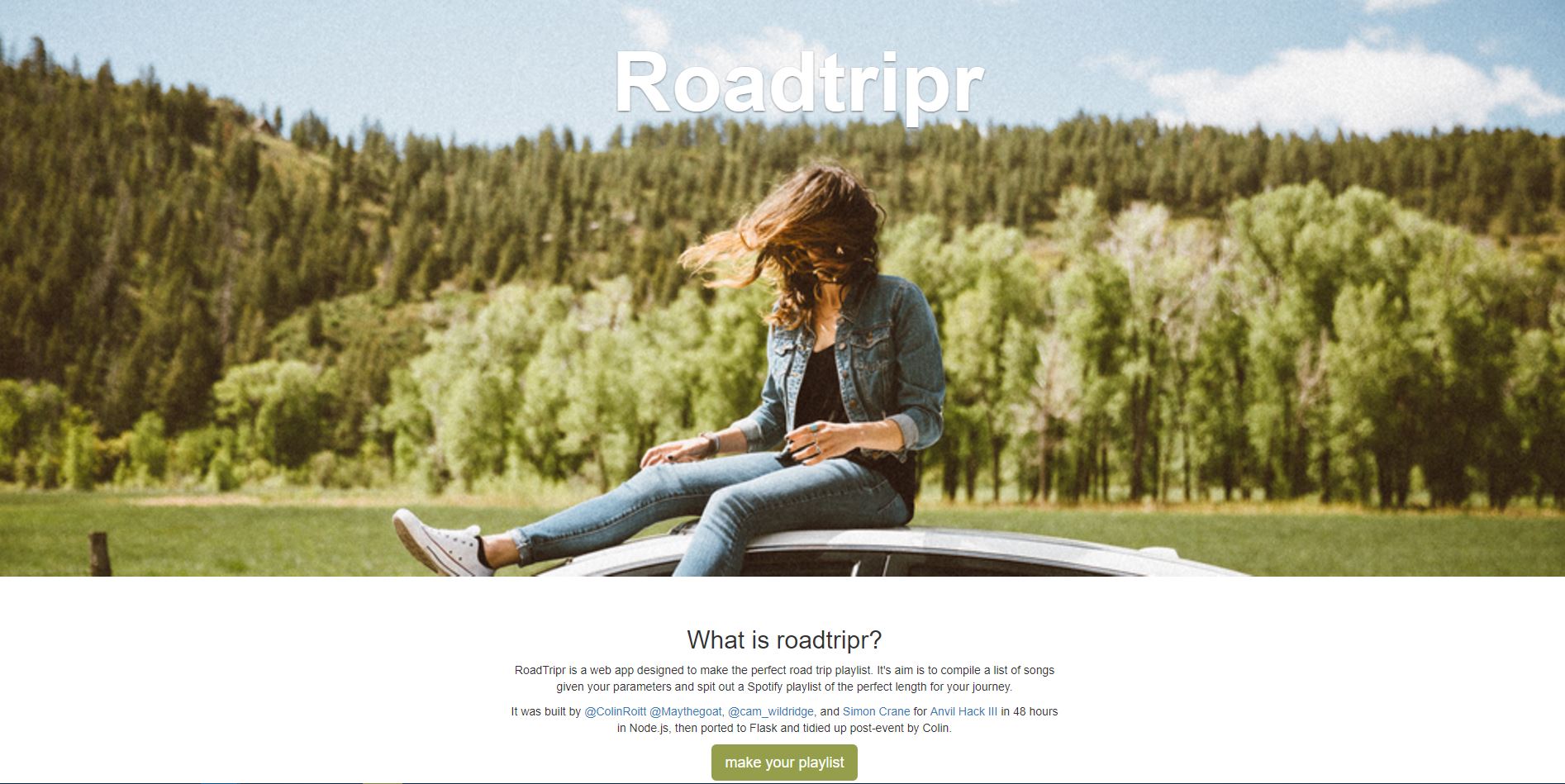
Roadtripr - The perfect road trip playlist
My friends and I entered a competition to build something interesting in 48 hours. Amidst a lot of
fun and very little sleep we built Roadtripr. An application that connects to music streaming service
Spotify. You simply tell it about your journey and music preferences and it will add a playlist of music
directly to your account. This was something we built some time ago but remains something I remember
fondly having learned so much in the process.

George Cann Garden Machinery
Working with the client was especially important here. A small local business with a strong reputation -
it was important that they got that feel through their website and the information was clear and
apparent. Moreover, however, the client had a vision of how the website would look and it was important
that was met.


